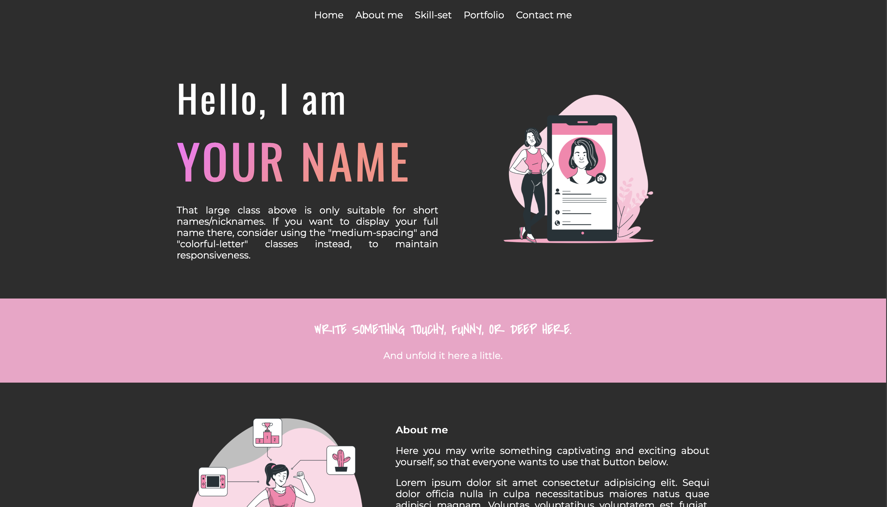
From Scratch to Open Source
My primary goal was to create a webpage using only HTML and CSS, avoiding external libraries like Bootstrap. While Bootstrap is valuable for smaller projects, I wanted to challenge myself by developing a clean, custom solution for my portfolio.
This project allowed me to delve into flexbox, grid systems, and the box model while focusing on clean coding, reusability, and responsiveness.
I organized my CSS into a clear class system, breaking it down into sections like fonts, background colors, alignments, animations, and media queries. This structure enhances readability and maintainability.
Explore my code on GitHub !
General setup
Section setup
Mobile Preview: The mobile preview video showcases how the portfolio template adapts to smaller screens, like smartphones. It demonstrates the responsiveness and user experience on mobile devices. If you're accessing websites on your phone, this video is for you.
Tablet Device Preview: This video provides a comprehensive view of the portfolio template as it appears on a tablet or larger screen. You can see the layout, design, and interactive elements clearly. Watch this if you're interested in a full-sized experience.
The portfolio template now supports system preference mode, allowing users to automatically switch between light and dark themes based on their device settings. This enhancement provides a more personalized and user-friendly experience for visitors.